
We were tasked to create a rubbish font and no, it doesn't mean that we have to make a crappy font. It is based on our definition of what rubbish is.
As I did a mind mapping exercise for my own definition of rubbish I came up with words such as; dirty, imperfect, incomplete and stains. The word stain made an impact in my mind and I then started thinking of things that have been tainted. From there on, I started thinking of things that left a stain and I had one major player in mind: food.
I created a couple of drafts using different kinds of edi
ble things that leaves stains but due to time constraints and the lack of skill in photoshop that I possess, I decided to do a simple and traditionally made stain using coffee.

I'm pretty pleased with the outcome, given the fact that I have never experimented painting with coffee before. It actually looked pretty nice, and the smell just made me want to eat it as well, but that's another story.
But a simple photograph of something that I have done is not eno
ugh. This is a visual design and digital media subject after all. So I started to look at the possibilities of how I could bring character to my coffee creation.
I needed another concept and so I played around with the photograph. Thought after thought built up one after the other as I try and make something out of it. Alas, a new concept was born!
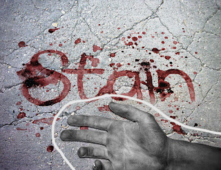
I came up with this design, transforming the coffee stain into a bloodstain. It gave me such an eerie and creepy feeling as the whole thing was coming together.
With this new design, another stain is created, a stain that is harder to remove from any other; blood.
Aaaaaaaaaand that wraps it up for now! I had fun doing this activity. Can't wait for the next one! Toodles! ~*^_^*~
Hi Johann!
ReplyDeleteI'm here to review your rubbish font :D
I think it's cool how you painted to create your font rather than crating it with photoshop.
The second concept that you made is also super cool, and like the addition of the pavement background, the dead hand and the chalk outline.
The piece is visually striking.
Perhaps next time you could make it bigger, or write a longer message, because I'd like to see more of this font.
Also . . . maybe you could play with the exposure and brightness levels of the first picture so that the colours are more visible.